Navexa Embedded Components Documentation
Embedded components are custom-built web components that integrate with your Navexa portfolio to display your true performance on your blog or website.
Component Types
Navexa currently provides three types of Components.
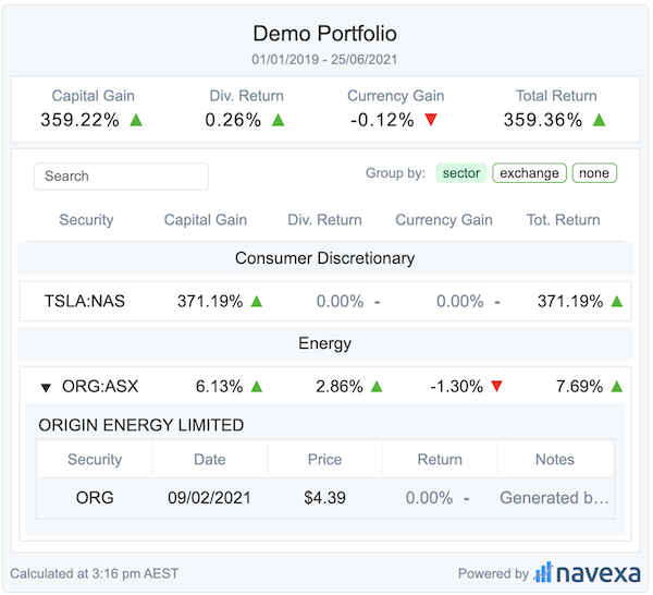
- Portfolio: Displays your portfolios total performance
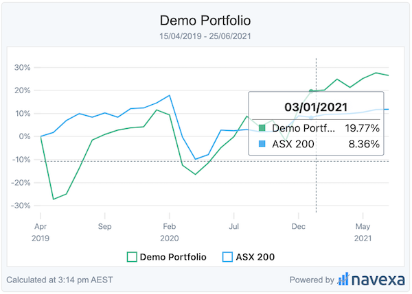
- Chart: Displays a chart of your portfolio’s total performance %
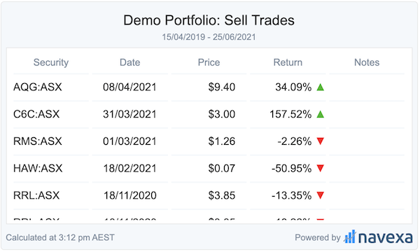
- Trades: Displays a list of trades executed in your portfolio
Each component has several configuration and customisation properties, detailed in this document.
Portfolio Component

Settings:
Notes:
- Settings must be manually configured by Navexa. Reach out to your Navexa contact to adjust these settings!
- All Columns can be renamed, reordered or hidden.
** = Premium publisher feature. Only available upon special request
- Include Trades **
- A list of each holdings trades are available in an expanded section. View screenshot.
- Total Performance Columns
- Capital Gain %
- Dividend Return %
- Currency Gain %
- Total Performance %
- Date Preset:
- all-time (default)
- today
- last-7-days
- last-30-days
- this-month
- past-year
- year-to-date
- last-two-years
- last-3-years
- From date:
- Start date for the portfolio performance calculation
- If not set, defaults to first trade date
- To date:
- Performance will be calculated up until this date
- If not set, it will default to the current date
- Include Closed Positions: this one needs a blog link and a help page.
- Holding Table Columns:
- Security: Symbol + Exchange
- Capital Gain %
- Dividend Return %
- Currency Gain %
- Total Return %
- Buy Limit **
- Current Recommendation **
- buy, sell, hold
- Stop loss limit **
- Last Trade on Holding **
Chart

Settings:
Notes:
- Settings must be manually configured by Navexa. Reach out to your Navexa contact to adjust these settings!
- All Columns can be renamed, reordered or hidden.
** = Premium feature. Only available to paying customers
- Include Benchmark **: Plots your configured benchmark against your portfolio
- Date Preset:
- all-time (default)
- today
- last-7-days
- last-30-days
- this-month
- past-year
- year-to-date
- last-two-years
- last-3-years
- From date:
- Start date for the portfolio performance calculation
- If not set, defaults to first trade date
- To date:
- Performance will be calculated up until this date
- If not set, it will default to the current date
- Include Closed Positions: this one needs a blog link and a help page.
Trade Component

Settings
Notes:
- Settings must be manually configured by Navexa. Reach out to your Navexa contact to adjust these settings!
- All Columns can be renamed, reordered or hidden.
** = Premium feature. Only available to paying customers
- Trade Type Filter: Trades types you wish to display
- Columns:
- Security: symbol + exchange
- Trade Date
- Price
- Return %: only available for sell trades
- Notes
- Date Preset:
- all-time (default)
- today
- last-7-days
- last-30-days
- this-month
- past-year
- year-to-date
- last-two-years
- last-3-years
- From date:
- Start date for the portfolio performance calculation
- If not set, defaults to first trade date
- To date:
- Performance will be calculated up until this date
- If not set, it will default to the current date
- Include Closed Positions: this one needs a blog link and a help page.
Customizing Styles
You might want to change the Embedded Component’s styling to match your blog or website. Easy - the components are extremely customisable.
Warning: Although it possible to hide the Navexa logo, any attempts to modify, obstruct or restrict visibility or interactivity are prohibited. Violations of these terms will result in restriction and possible termination of components and other published media provided by Navexa.
Wordpress Steps
- Navigate to the page where you plan to embed your component
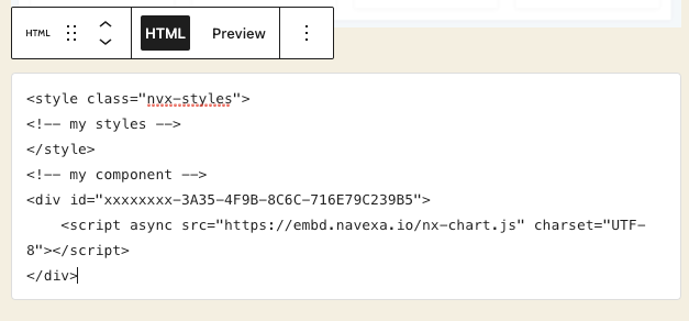
- Create an HTML block

- Create a special style tag
- Note: You should only need to create the style tag ONCE PER PAGE. Only the first will be used by each embedded component per page.
- Enter your html embed code
- Customize the styles according to the following per-component style-guide below.
Example:
<style id="nvx-styles">
</style>
HTML Steps
- Navigate to the html document you plan to embed your component
- Create a style tag at the head of your blog/ website, with a tag of
class="nvx-styles". - Embed your custom component
- Customize the styles according to the following per-component style-guide below.
Example:
<!DOCTYPE html>
<html lang="en">
<head>
    <title>My Portfolio Blog</title>
    <style class="nvx-styles">
        <!-- my styles -->
    </style>
</head>
<body>
    <!-- my chart component -->
    <div id="xxxxxxxx-3A35-4F9B-8C6C-yyyyyyyyyyyy">
        <script async src="https://embd.navexa.io/nx-chart.js" charset="UTF-8"></script>
    </div>
</body>
</html>
CSS Styles
Each component primarily uses css variables to customise the theme. Each of the variables following can be used to style and decorate the portfolio component:
The variables need to be defined in a main element to be correctly set.
<style class="nvx-styles">
main {
    /* My styles */
}
</style>
Portfolio Styles
main {
    /* Changes the width of the component */
    --nx-width: 600px;
    /* Only used for special publisher components */
    --nx-publisher-max-width: 850px;
    /* Changes the maximum height of the holdings list table */
    --nx-holdings-height: 300px;
    /* Changes the font attributes */
    --nx-font-family: Arial, serif;
    --nx-font-size: 1rem;
    --nx-font-weight: normal;
    /* Changes the component border radius */
    --nx-border-radius: 5px;

    /* The various colour swatches used over the component */
    --nx-green: #22b922;
    --nx-red: #ff0319;
    --nx-grey: #7e8e9f;
    --nx-card: white;
    --nx-text: #333;
    --nx-background: #f4f8fb;
    --nx-border: #e7e7e7;
    --nx-detail: #fbfbfb;
}
Chart Styles
main {
    /* Changes various font attributes */
    --nx-font-family: Arial, serif;
    --nx-font-size: 0.875rem;
    --nx-font-weight: normal;
    --nx-border-radius: 5px;

    /* The various colour swatches used over the component */
    --nx-green: #22b922;
    --nx-red: #ff0319;
    --nx-grey: #7e8e9f;
    --nx-card: white;
    --nx-text: #333;
    --nx-background: #f4f8fb;
    --nx-border: #e7e7e7;
}
Trades Styles
main {
    /* Changes the width of the component */
    --nx-width: 600px;
    /* Changes font attributes */
    --nx-font-family: Arial, serif;
    --nx-font-size: 0.875rem;
    --nx-font-weight: normal;
    --nx-border-radius: 5px;

    /* The various colour swatches used over the component */
    --nx-green: #22b922;
    --nx-red: #ff0319;
    --nx-grey: #7e8e9f;
    --nx-card: white;
    --nx-text: #333;
    --nx-background: #f4f8fb;
    --nx-border: #e7e7e7;
}